Chapter 1 — The Layout Ceiling
When I joined Bing Image Search, the SERP image answer was a standard waterfall grid. My first mandate was straightforward: make it better.












What we tried
We started with incremental adjustments — padding, margins, density tuning. Then, as other SERP segments began adopting magazine-style layouts, we followed.
But magazine layouts introduced a new constraint: they work best when images are organized around a theme. A flat stream of search results doesn't naturally have one. So we started experimenting with ways to create structure — splitting ambiguous queries into semantic clusters, introducing in-card titles, testing row-based vs. waterfall arrangements.
Over the next several months, I led 9 rounds of UX Labs testing 50+ design concepts, comparing:
- Waterfall vs. magazine vs. row-based vs. masonry
- Pole position treatments
- RS-entity and RS-visual magazine variants
- Mixed image + video layouts
What we learned
There was no clear winner. Users wanted contradictory things:
- Waterfall for "larger, clearer, vivid, high quality" images
- Magazine for "organized, easy to navigate and compare, easy to browse"
Every layout had trade-offs. Incremental improvements weren't converging on anything shippable. ACF-compliant containers showed engagement regressions. The team spent significant energy just making existing layouts behave — responsiveness, reflow, image-dropping logic at smaller viewport widths.
The breakthrough (and the pivot)
We eventually found a new approach: pure image cards with no in-card titles, filling the entire card surface with imagery. This was a meaningful step forward from the traditional magazine format.
Once this pattern proved itself, we expanded it into a full-size card system — from 2×2 (200×200px) all the way to 11×4 (1208×424px) — building a complete library of image card assets. These weren't just for our own Image Answer; we made them available to other SERP segments as a shared component. What started as a layout experiment became an infrastructure contribution.
We also solved an engagement problem that had persisted through the layout transitions. On the pure image cards, I added an overlay See More button on the last image in the card — a small, contextual nudge rather than a separate UI element. The results were significant:
- DAU and short-term engagement both up — statistically significant on desktop and mobile
- Overall click-through up, with image click-through growing double digits
- Measurably more traffic flowing into Image Vertical
This became a permanent design pattern that we've kept ever since — proof that the right micro-interaction in the right place can move macro metrics.
But the bigger shift was coming. By September–October 2025, we started exploring AI-driven layouts — structured top answers, semantic categorization, intent-based rendering. This became vNext.
The insight I took from the layout experiments wasn't just "waterfall vs. magazine doesn't matter." It was that layout-level optimization had hit its ceiling. The real opportunity was in how we structure answers, not how we arrange images.
Chapter 2 — Small Change, Big Leverage: The See More Story
Before vNext fully kicked off, a crisis hit. The ACF (Answer Card Framework) transition caused performance drops across Image Answer. By November 2025, the team identified the primary regression hotspot: the See More button in Mainline.
This was a different context from Chapter 1. Everything above — the layout experiments, the overlay See More — happened in TopWide, the premium slot above algorithmic results. Chapter 2 is about Mainline, where Image Answer lives alongside other verticals. When ACF rolled out across Mainline, it broke things that had been working fine.
My intervention
Instead of proposing a layout redesign, I focused on the behavioral bottleneck. The See More button had become visually recessive — small font, theme-colored text that blended into the page.
I proposed the minimum viable change:
- Font size: 13px → 16px
- Color: theme color → always-blue (still using ACF tokens)
Two CSS properties. That's it.
The result
After flighting (results reported in December 2025):
- APSAT improved (user satisfaction)
- PCR increased (click-through)
- Image vertical revenue up ~1% — seven figures annualized
I presented the results at the Search Design Council Review and requested to ship.
The twist
ACF coherence reviewers didn't sign off. The always-blue treatment, despite being built with ACF tokens, was deemed inconsistent with the broader design system direction. The change remains in flight limbo — effective but unshipped.
Why this matters for design judgment
This isn't a story about a button. It's about knowing where to act. In a complex system-wide regression with dozens of potential causes, I identified the single highest-leverage point and proved it with the smallest possible intervention. Sometimes the most impactful design decision is choosing not to redesign.
Chapter 3 — vNext: From Layout to System
Chapter 1 ended with a realization: layout-level optimization had hit its ceiling. But the real insight went deeper — the ceiling wasn't about finding the right layout. It was about the model itself: a human designer choosing one layout for all queries.
A search for "sunset wallpaper" and a search for "iPhone 16 colors" have fundamentally different intents, yet they were being served the same grid. No single layout could satisfy both. The answer wasn't a better layout — it was a system that could adapt.
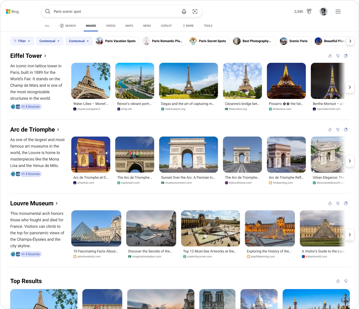
That's what vNext set out to build. Image Search would evolve from a waterfall results page into a structured answer system based on visual intent types. Instead of one best layout, we'd define a library of modular components — Hero, Category Selector, Swimlane — and let AI assemble them based on what it understood about the query. My role shifted from "design the best page" to "design the building blocks that AI can compose."
Each component needed to be self-contained enough for AI to deploy independently, yet coherent enough to combine without visual chaos. I was responsible for defining these in the early stage — not pixel-level execution, but the structural logic: what each component is, what job it does, and where the boundaries are.
We started in Image Vertical rather than SERP, where strict ACF coherence requirements would have slowed experimentation. Vertical was our sandbox; proven patterns would migrate to SERP later.
The Experience Chain
These three components aren't parallel options — they form a progression from confirmation to decomposition to exploration:
- Hero confirms the query's primary visual meaning (What am I looking at?)
- Category Selector decomposes broad queries into structured directions (Which aspect do I want?)
- Swimlane expands parallel sub-intents for side-by-side exploration (What else could this mean?)
Below all of these, the traditional image grid remains as the deep-browse fallback. This chain — confirm → decompose → expand → browse — is the core information architecture of vNext.
Hero — Primary Visual Anchor
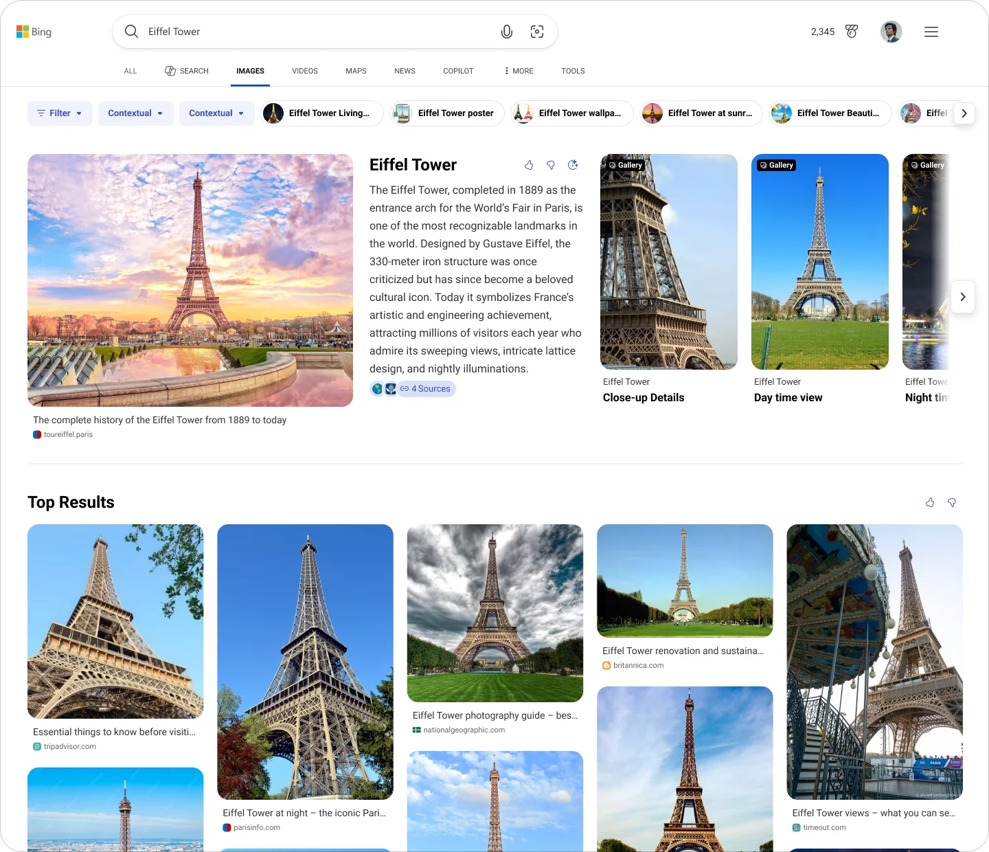
Hero is triggered when a query has a clear, representational visual answer — entity or near-entity searches where there's a canonical image. Its job is to be the visual anchor that establishes semantic context for everything below it.
The instinct across the team was to treat Hero as a "bigger grid": pack in more images, more links, more everything. I pushed back. Hero's value comes from focus, not density. It should confirm "this is what you're looking at" — not overwhelm with options.
There was internal pressure to fill whitespace on wide screens. I provided directions at different density levels, but my core position didn't change: Hero's value comes from what you leave out, not what you pack in.
Category Selector — Structured Intent Decomposition
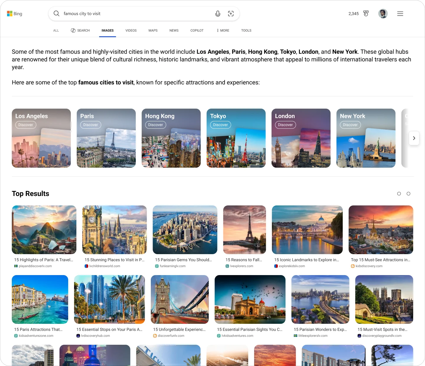
Category Selector addresses a specific problem: queries that are broad but still within a single topic domain. A user searching "wedding dresses 2025" or "most popular cars in the usa" isn't looking for one image — they're exploring a visual category and need help narrowing down.
Category Selector's job is to decompose that broad query into structured directions, telling the user: here are the angles you can explore from here. It's an information architecture component — navigation — not a visual garnish.
This distinction was critical. Early conversations treated it as a decorative row of chips below the AI answer. By reframing it as structural navigation, I ensured it could scale: same role across Vertical, SERP, and GenIE, with adapted presentation per surface. The user behavior it supports is always the same: select a direction → enter a sub-intent.
Swimlane — Parallel Visual Intent Exploration
Swimlane handles a different problem from Category: queries where multiple sub-intents are all simultaneously valid. Search "jaguar" and you might mean the car or the animal. Search a product and you might want to compare by style, scene, or use case. These parallel meanings shouldn't be mixed into one grid — they need to be separated and surfaced side by side.
Each Swimlane carries a clear label representing one sub-intent, supporting horizontal browsing and quick comparison. The key distinction from Category: Category asks the user to choose a direction; Swimlane unfolds parallel possibilities without requiring a choice.
I defined the structural logic — what triggers a Swimlane, how sub-intents are labeled, how multiple Swimlanes relate to each other — while the visual execution (1-row vs. 2-row carousel, card sizing) was refined downstream.
What Changed
The shift wasn't just in what we built. It was in what we delivered.
Before vNext, a designer handed off a page layout with redlines. After vNext, we handed off a component system with behavioral rules — when Hero appears, how Category decomposes broad intents, what Swimlane surfaces as parallel exploration. The design deliverable became a contract between human designers and an AI renderer.
I defined the component architecture and the confirm → decompose → expand chain. A senior designer on the team continued with mobile execution, AI filters, and detailed refinement. This was a deliberate split: early architecture vs. late implementation. The components I defined are now live in Image Vertical vNext — and they became the foundation for what came next.
Chapter 4 — Scaling: From Vertical to SERP GenIE
Once the vNext components proved themselves in Vertical, the next question was natural: could these AI capabilities work on SERP?
This wasn't handed to me — I proposed it. At the Search Design Council Review, I made the case:
- Competitors were pushing AI mode experiences
- Image Vertical was already AI-first
- SERP had the same image queries but none of the AI enhancement
Bridging two worlds
The challenge wasn't just "put Vertical components on SERP." SERP has different constraints — ACF coherence requirements, different viewport contexts, mobile considerations, card-size limitations.
I provided two structural directions:
- ACF-based — built on existing SERP patterns
- Vertical-derived — adapting vNext components to SERP constraints
For Hero and Carousel, both directions were viable, and we've shipped them to SERP. Category was the hardest — it doesn't have a natural SERP equivalent, and I flagged this as requiring team alignment rather than pretending it was solved.
How it landed
The proposal became SERP GenIE — the AI image answer on the search results page — and I carried the design for both desktop and mobile. Through 2026, the pieces cleared the gates one by one: the multi-carousel answer passed the design system's coherence review — its strictest gate — backed by lab evidence for the 2-row carousel format (the same evidence-over-preference discipline from Chapter 1, applied at the review layer). Category Selector, the component I'd flagged as hardest, found its SERP shape and cleared review as well. And TopWide shipped — a new wide-answer format that replaces the original mainline answer.
Getting AI-first components through a design-governance framework built for traditional answer cards was its own design problem — every component had to be argued in the system's language: tokens, zones, card templates, accessibility contracts. That experience of governing AI-assembled UI led directly to my next project: architecting the multimedia component library that makes this class of work reviewable in the first place.
















Chapter 5 — Impact & Reflection
What shipped
- Image Vertical vNext — live, with AI top answers (Hero, Category, Swimlane)
- TopWide — a new wide-answer format replacing the original mainline answer
- Accessibility gate passed — Sev1/Sev2 issues tracked and resolved before flighting
- Component system reusable across 3 surfaces (Vertical / SERP / GenIE)
What cleared review
- SERP GenIE — multi-carousel AI image answer through the design system's coherence review, with me carrying desktop + mobile design
- Category Selector on SERP — the hardest component, through the same gate
What was proven but not shipped
- See More button — ~1% image vertical revenue lift (seven figures annualized) in flight, pending ACF coherence sign-off
By the numbers
- 9 UX Lab rounds, 50+ concepts tested
- 4 responsive Hero directions proposed
- 3 core components defined (Hero / Category / Swimlane)
- 3 surfaces unified (Vertical / SERP / GenIE)
Design Principles (emerged from this work)
1. Intent-driven hierarchy Use user intent to determine CTA priority and information structure — not component specs or convention.
2. Cross-surface coherence over local optimization SERP, Vertical, and GenIE are one system with different constraints, not three separate products.
3. Reduce noise, preserve answer intensity Not all whitespace needs filling. A top answer's job is to feel authoritative, not comprehensive.
4. Evidence over preference When a design decision is ambiguous, push it into a flight or UX lab. Opinions don't ship — data does.